

Neon Poppy
A Lifestyle Magazine Concept
Project Type
Editorial Design, Visual Identity
Tools
Adobe Indesign, Illustrator, & Photoshop
Neon Poppy is a magazine concept focusing on the issues and interests most important to the multi-faceted women of today: career, politics, style & beauty, mental & physical health, pop culture, relationships, and more.

Objective & Purpose
The magazine's objective was to create a female-based editorial publication with content on a wide range of subjects that women today are interested in and concerned with. This magazine was designed for an Advanced Typography class at UMass Lowell and received an A.
Articles and accompanying photos were sourced from The Cut and Vulture. Other images featured are royalty-free stock images courtesy of Unsplash.

Concept & Inspiration
Online lifestyle publications like The Cut and Teen Vogue inspired the magazine's content because of the conventional fashion and beauty content but with the inclusion of pop culture, politics, news, health, etc.
Fashion and lifestyle publications like Cosmopolitan, Elle, and Nylon inspired the look and feel with modern elements and a fresh and feminine vibe.


Palette & Type
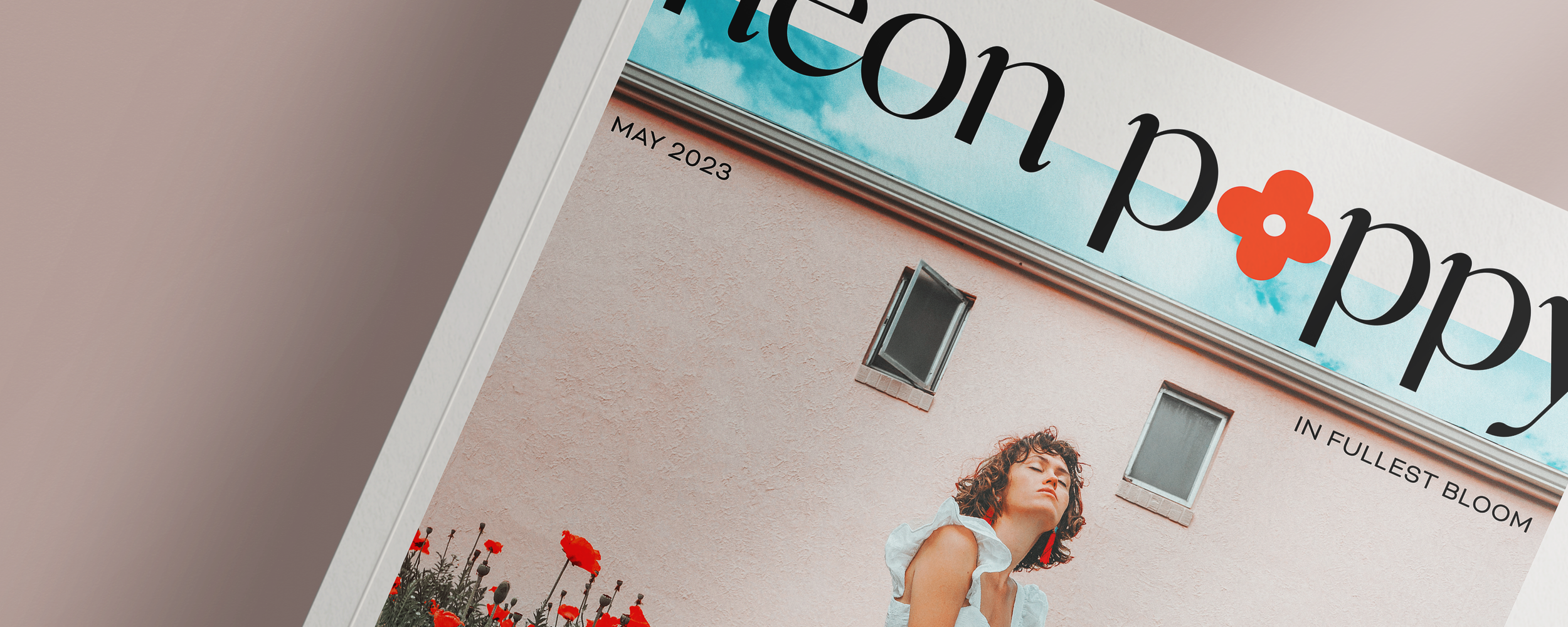
The color palette would change monthly with a through line between the cover and articles. The poppy logomark is displayed in a bold red-orange vermillion and stays the same from issue to issue.
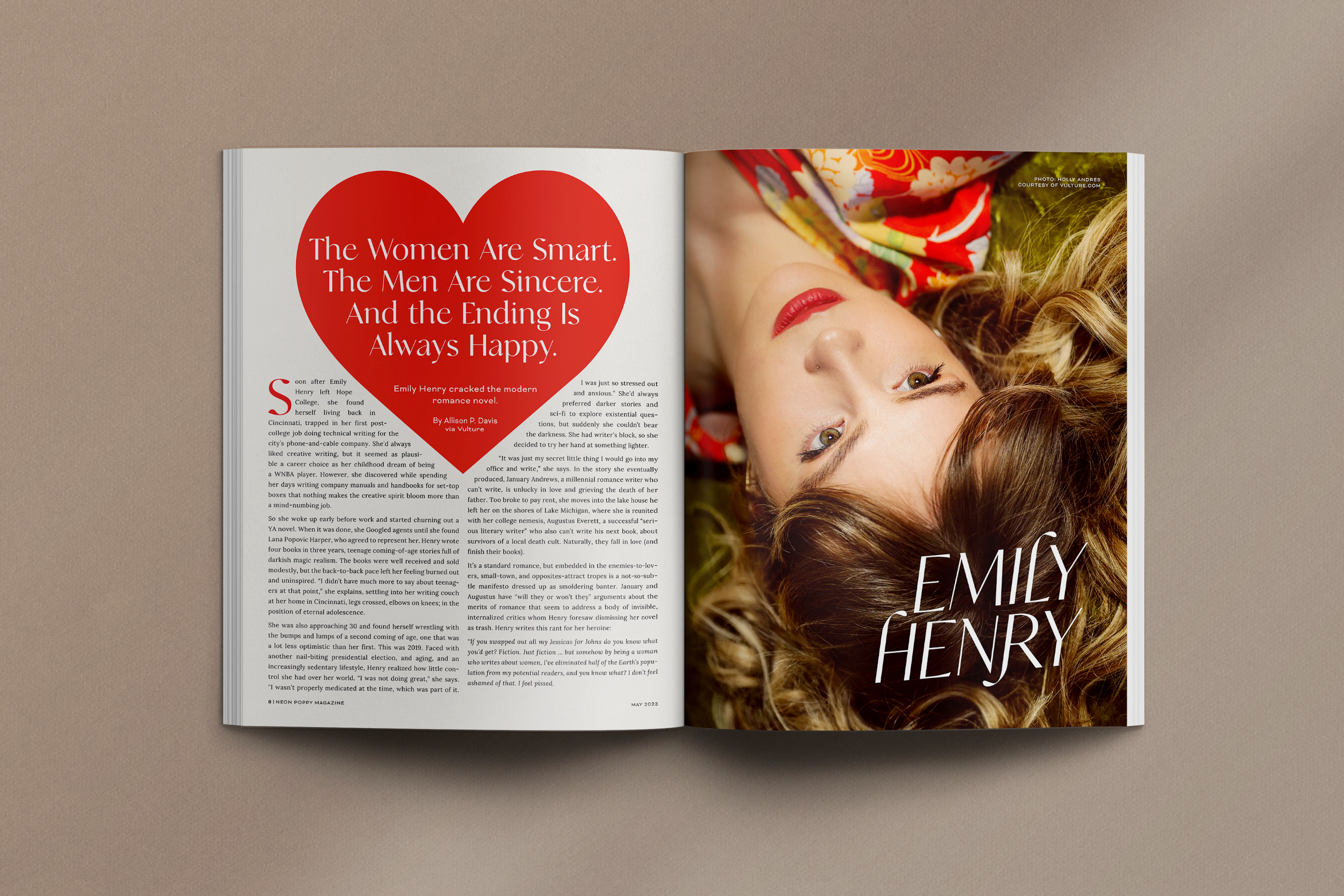
Neon Poppy's logo is designed in the typeface Analogue by the studio Tropical Type. It is used throughout the magazine in regular and uppercase italics. You can see the italics version used for the article title on the wellness industry and Emily Henry's name, who is profiled in the second article. Sans-serif type, Bicyclette is used for headers and subheaders. It offers a modern departure from Analogue, providing both contrast and cohesiveness. Lora Regular, a serif font, is used for article text for easy readability.


Cover Design
Drafts: Several drafts were created for the cover and were narrowed down to the concepts here. Different forms of framing were tried, as well as variations in the chosen typefaces, other imaging, and flower logo marks.
Final: For this concept issue, stock photos featuring an abundance of poppies were the right choice. The publication logo was still in development during drafting, and seeing it in place with covers solidified the final choice.


Spread Designs
The aim for the spreads were eye-catching photography, bold colors, and interesting articles with variations in the subject.
The first article was written by Ling Ling Huang for The Cut, discussing her experience and disillusionment in the wellness industry. You can find the article here.
The second article is a profile of romance author Emily Henry, who has made a big splash in the genre in the past few years, written by Allison P. Davis for Vulture. She discusses writing, love, and her newest book at the time of publication. You can find the article here.


Results
The finished magazine fulfilled the assignment's requirements and achieved the goals set out at the beginning of the project.
