Syncopate Magazine
An Online Music Magazine Concept
Project Type
Editorial Design, Visual Identity
Tools
Adobe Indesign, Illustrator, & Photoshop
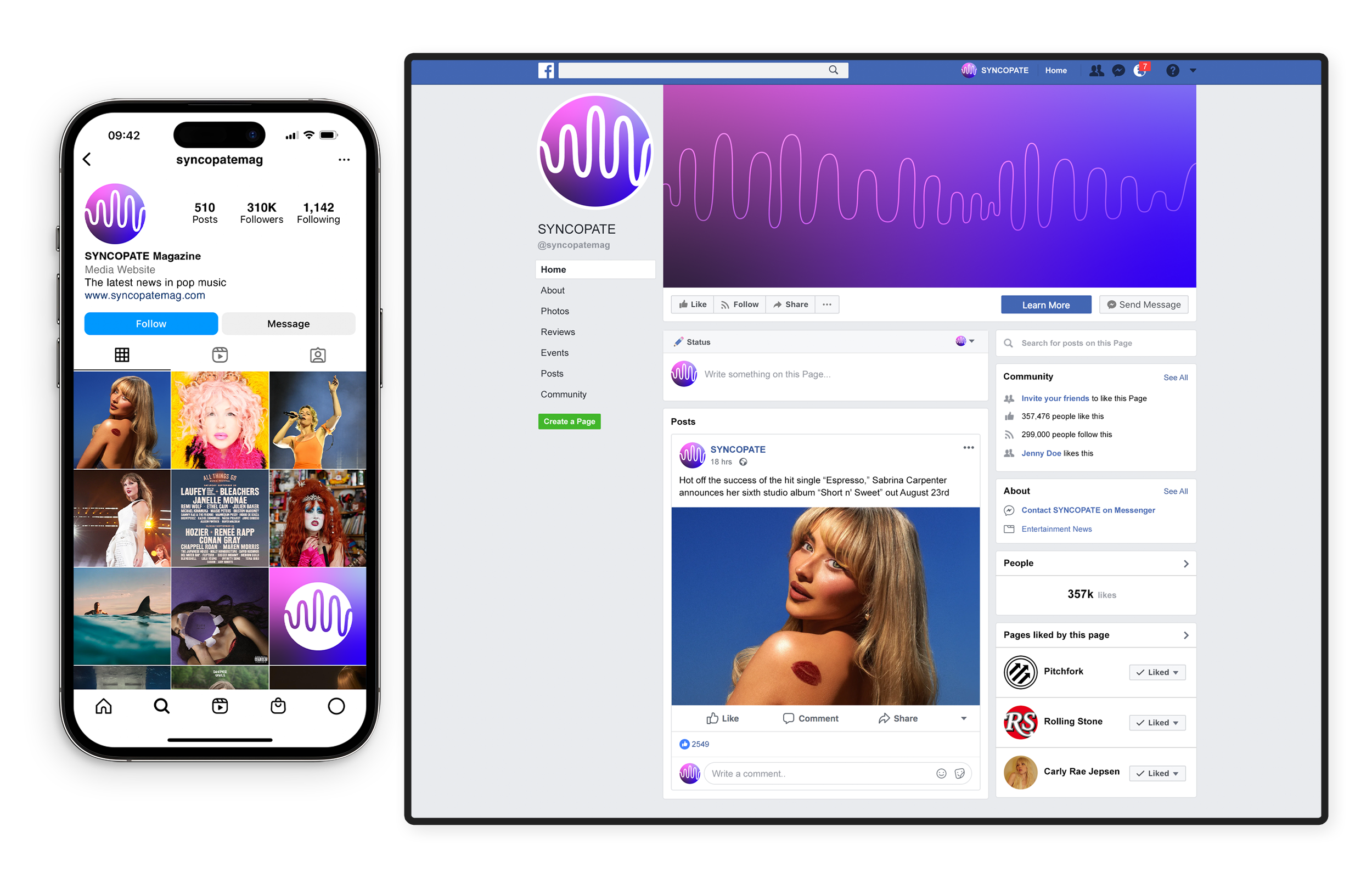
SYNCOPATE is an online music publication concept for everything pop. Drawing from inspiration of the past and the sound of the future, SYNCOPATE embraces the emotional, bombastic sound of bouncy pop loudly and shamelessly. The publication would focus on album reviews, music news, interviews, and opinion discourse on the genre by leading voices in the industry and the fans.
syncopate: disrupting the beats or accents in music or a rhythm so that strong beats become weak and vice versa
The objectives of the class project was to practice logo creation and brand identity. When developing the concept for the magazine, I wanted to create a visually striking brand identity that reflects the energetic and dynamic nature of pop music.
Objectives
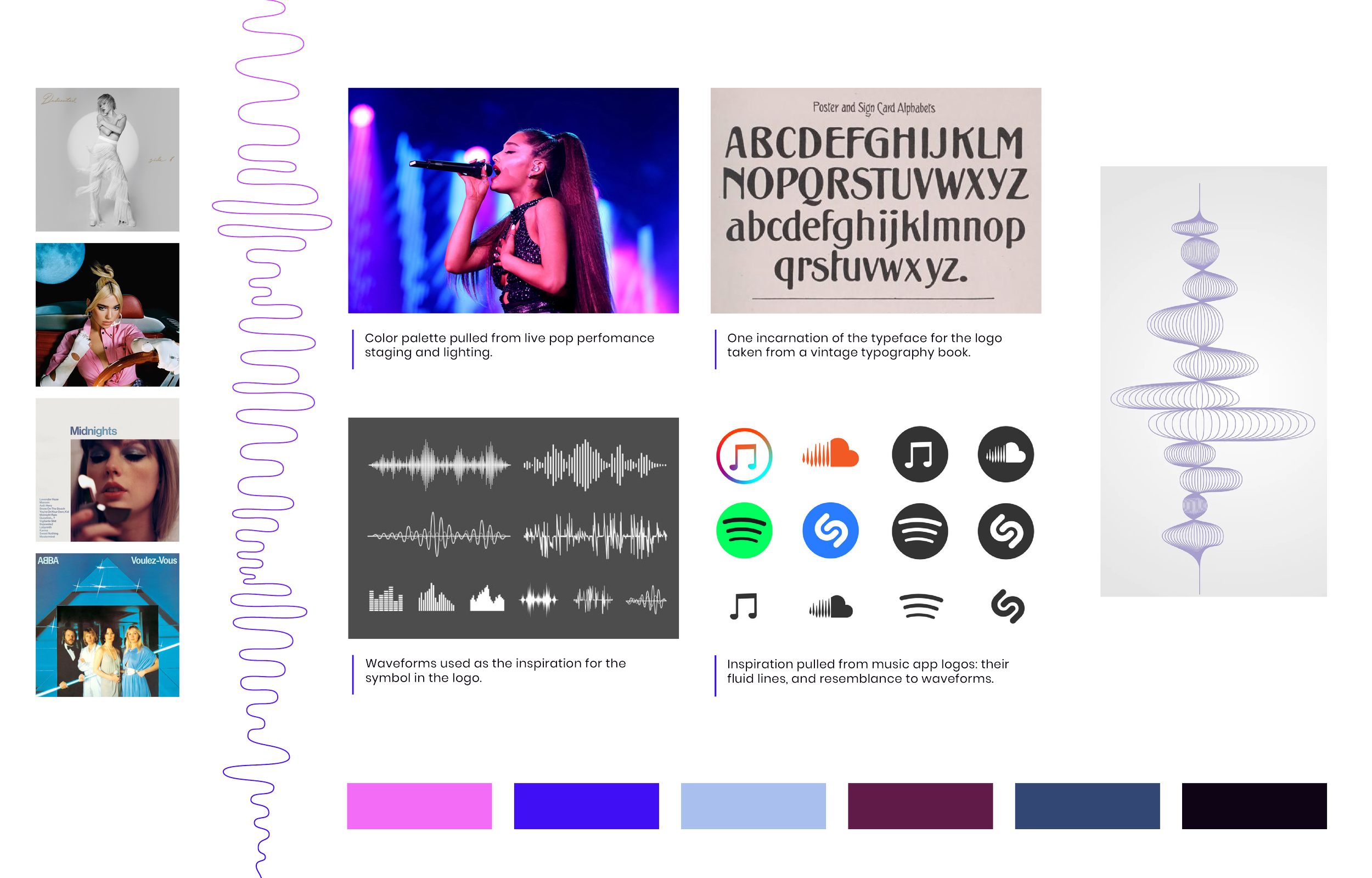
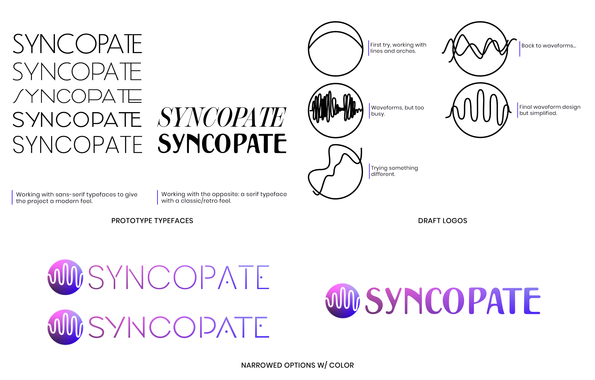
The initial phase involved extensive research into the pop music genre, its history, and its visual representation. Mood boards were created to visualize the aesthetic direction, incorporating color schemes, typography, and layout inspirations. Multiple design iterations were developed, each refining the balance between vintage and modern elements.
Research and Development
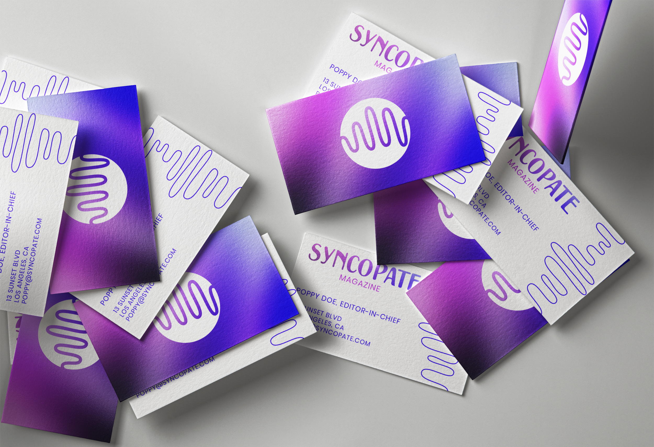
SYNCOPATE's color palette is a bold and electrifying mix of cobalt blues, purples, pinks, and black. These colors were chosen to evoke the vibrant, high-energy world of pop music, creating a sense of excitement and dynamism.
The typography in SYNCOPATE's logo is based on a vintage typeface, giving a nod to the classic eras of pop music while feeling fresh and nostalgic. The body copy uses a modern sans-serif typeface for readability and a clean, contemporary look.
Palette and Type
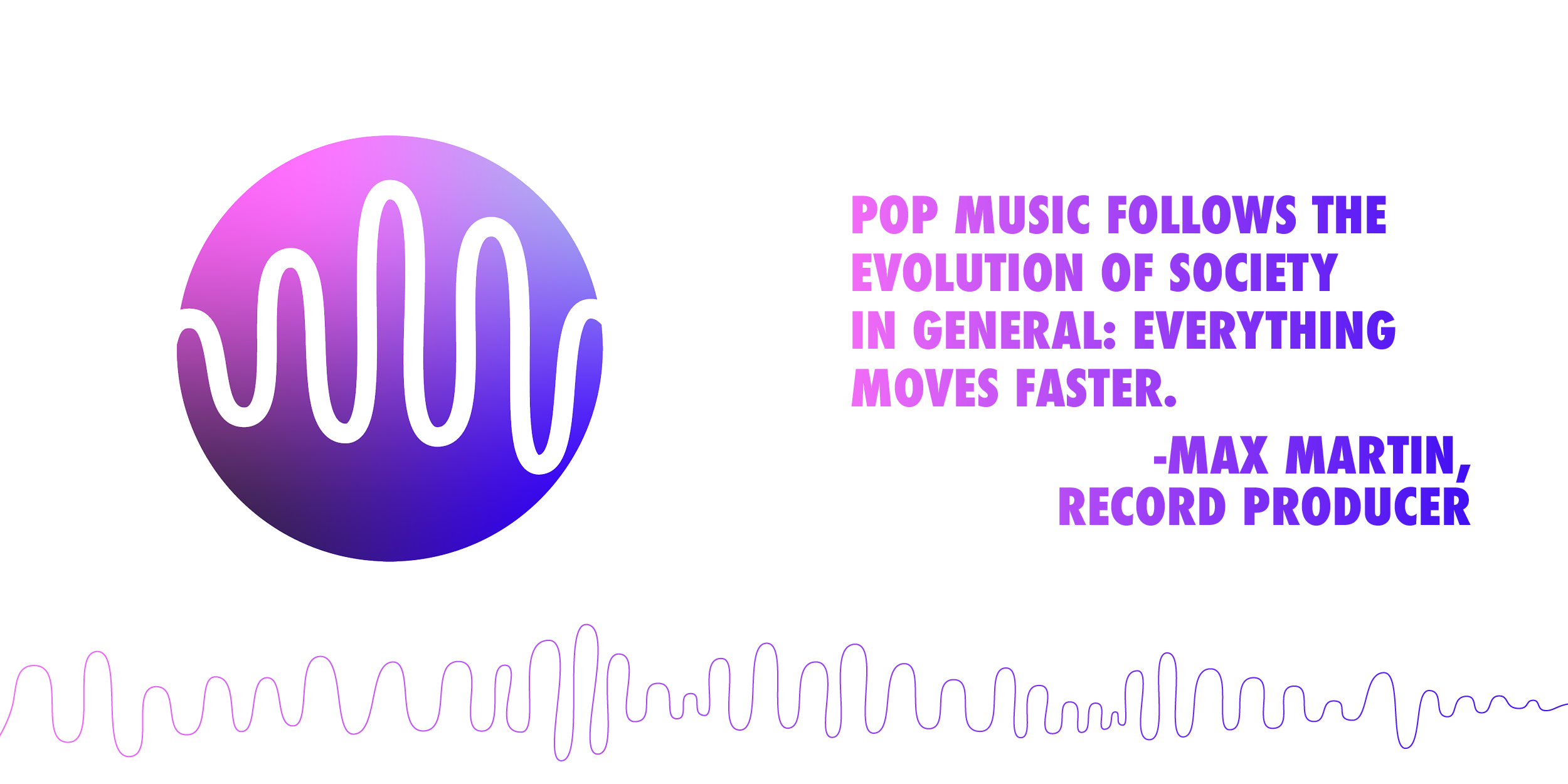
SYNCOPATE draws inspiration from the duality of pop music: its rich history and its ever-evolving future. Vintage music posters and album covers provided the foundation for the logo’s vintage typeface and contemporary pop culture inspired the bright colors and bold graphics that reflect current trends and the genre's future direction.
Inspiration
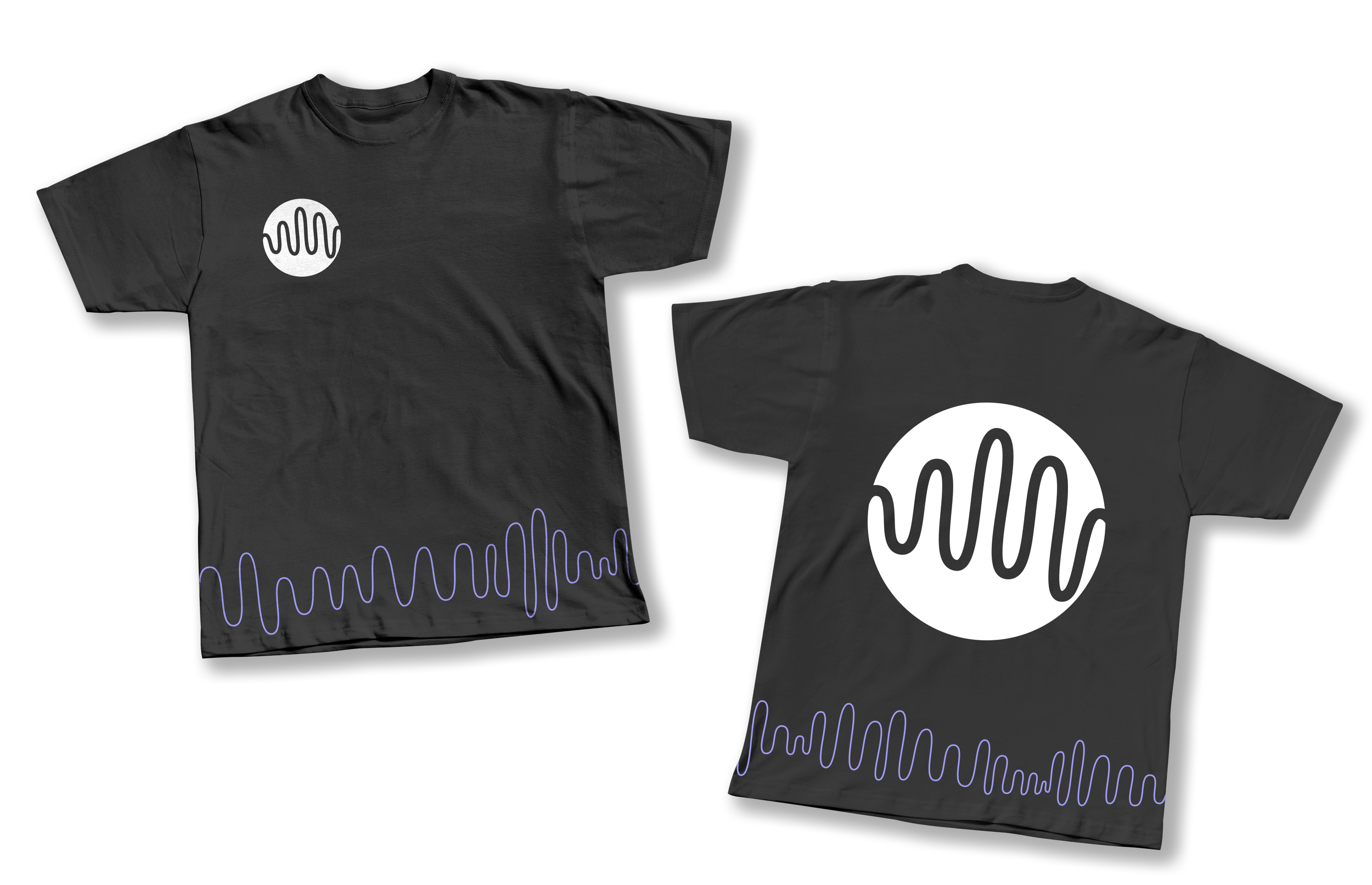
The final design for SYNCOPATE is a bold, vibrant representation of pop music. The striking color palette and distinctive typography create a memorable brand identity that stands out in the digital landscape. The project was well-received by the professor and peers and given an A.


